AREFEH GHADIRINASAB
LET'S CONNECT

Introduction

What is Dallas Flower Shop, and how can it enhance the online flower-buying experience?

Dallas Flower Shop is a trusted florist in Texas, delivering fresh, true-to-photo flowers with reliable service.

As a UX designer, I redesigned their website to create a more intuitive, confident, and seamless online shopping experience for customers.

Project Overview
Duration
3 Months
Team
Group of 3
Role
UX/UI Designer
Tools
Figma, Illustrator, Photoshop, Miro

Problem Discovery

Despite being a trusted florist, Dallas Flower Shop’s website created friction for users.

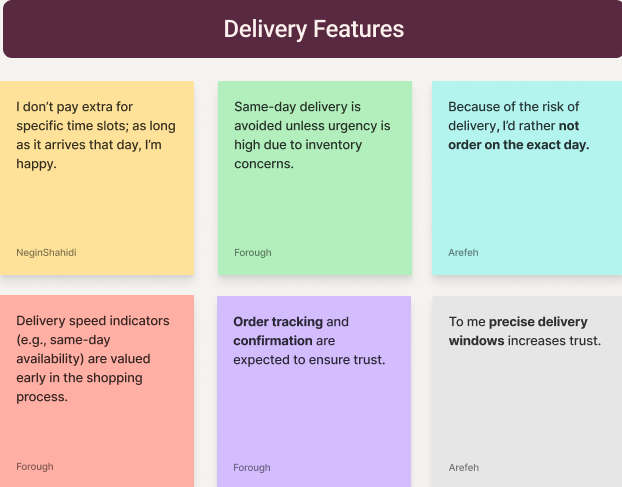
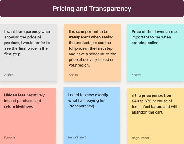
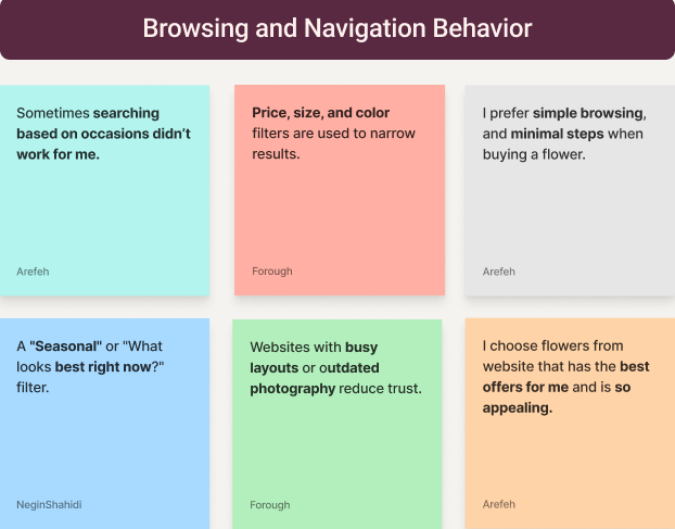
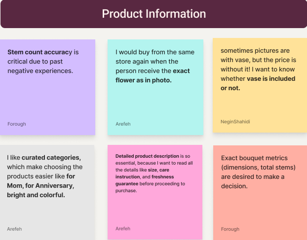
Research revealed issues with overwhelming navigation, weak visual hierarchy, and unclear delivery, product details, and checkout information, leading to frustration and abandoned purchases.

Business Goals

The redesign aimed to simplify navigation, clarify key information, and streamline checkout to improve the customer experience.

From a business standpoint, the goal was to boost confidence, engagement, and conversions while reinforcing a modern, trustworthy brand.

Design Process

Mapping Out My Design Journey

I applied the Design Thinking process to deeply understand user needs and iteratively refine the design, ensuring a more intuitive and engaging user experience.

1. DISCOVER

How did I understand the users?

To better understand user needs, I carried out three core research activities:

User Research
Competitive Analysis
User Interviews

User Research

Exploring Existing Insights

I reviewed articles on online flower purchasing behavior, e-commerce trust signals, visual decision-making, and delivery expectations to understand user needs and industry patterns.

I analyzed 200+ user reviews from Google, Yelp, and online florist platforms to uncover recurring feedback.

Takeaways from Reviewing Articles

  • Transparent pricing and clear delivery timelines are essential for building trust.
  • High-quality, realistic visuals reduce uncertainty and support confident decisions.
  • Simple filtering and guided discovery help users choose faster.
  • Reviews, guarantees, and visible support increase credibility.
  • Streamlined checkout and delivery updates improve conversion and satisfaction.

Key Takeaways from User Reviews

  • Challenges & Pain Points: Confusion around delivery timing, hidden fees, and difficulty understanding product size and appearance.
  • Positive Feedback: Customers value fresh flowers, on-time delivery, clear pricing, and responsive customer support.
  • Negative Feedback: Limited filtering, insufficient product imagery, and unclear order tracking.

Competitive Analysis

Analyzing Competitors

I conducted a preliminary SWOT analysis of five flower delivery platforms and chose three—FTD, UrbanStems, and Dr. Delphinium—prior to user interviews to build a foundational understanding of the market and identify key areas for exploration.

This analysis informed more focused interview questions, aligned research with business goals, and ensured the user research was strategic and relevant.

UrbanStems’ strong visual storytelling and curated browsing experience highlighted the importance of clear product presentation and guided discovery, informing interview questions around visual trust, sizing clarity, and decision-making confidence.

Dr. Delphinium’s simplicity emphasized the value of a lightweight browsing experience, shaping questions around clear navigation, essential information, and reduced decision friction.

FTD’s feature-rich experience highlighted the need to balance comprehensive options with clarity, shaping questions around filter organization, information hierarchy, and visual guidance.

User Interview

Discovering Insights from User Interviews

I conducted Zoom interviews with 9 participants (ages 25–40) who had previously ordered flowers online, using open-ended questions to encourage in-depth discussions. The goal was to uncover their motivations, frustrations, and expectations around browsing, selecting, and ordering floral arrangements.

Key Takeaways

  1. 1. Clear delivery times, pricing, and fees were essential.
  2. 2. Simple categories and filters helped users find flowers quickly.
  3. 3. High-quality visuals, size comparisons, and product details motivated confident decisions.
2. DEFINE

How did I synthesize research findings?

Affinity Diagram

Organizing Interview Insights

User goals diagram
Motivation drivers diagram
Navigation challenges diagram
User goals diagram
Motivation drivers diagram
Navigation challenges diagram
Insight diagram A
Insight diagram B

User Persona

Representing Our Target Audience

Research insights revealed recurring behaviors and pain points, helping me build empathy and inform the creation of a representative user persona.

User interview synthesis diagram
Problem Statement

Defining the Problem

Users struggle to order flowers online with confidence due to:

  • Unclear pricing and delivery fees
  • Difficulty understanding product size and stem counts
  • Inconsistent visuals and overwhelming navigation

They often experience frustration and mistrust during checkout, leading to hesitation or abandoned orders instead of a smooth, confident purchase.

Hypothesis Statement

Crafting the Hypothesis

If I design a flower-ordering experience with:

  • clear upfront pricing and delivery information
  • honest visuals with size and stem clarity
  • simple navigation and efficient checkout

Then users will feel confident ordering flowers, make decisions faster, and complete purchases without frustration or uncertainty.

3. DEVELOP

What solutions did I explore?

HMW Statements & Potential Solutions

Crafting Creative Solutions

To tackle user challenges and frustrations, I developed How Might We (HMW) statements paired with possible solutions, focusing on boosting engagement, motivation, and enjoyment while minimizing stress and confusion.

User interview synthesis diagram

Card Sorting

Arranging Contents for Better Navigation

After ideation, I conducted a closed card sorting session with nine participants to understand how users group floral categories and filters, then made a table and came to a conclusion about the categories. These insights informed a site map that aligns with users’ mental models and supports easier decision-making.

User interview synthesis diagram

Site Map

Structuring Our App Layout

I developed a site map grounded in user research to make the app intuitive, easy to navigate, and aligned with users’ expectations.

User interview synthesis diagram

Task & User Flow

Navigating User Tasks

The task and user flow map the steps users take to personalize a meditation session, ensuring a smooth and intuitive experience.

User interview synthesis diagram
4. Prototype

How did prototypes influence my design decisions?

Mid-Fidelity Wireframes

Refining Wireframes Based on User Feedbacks

In the prototyping phase, I created mid-fidelity wireframes to explore the florist website’s layout and key flows. I then conducted usability testing to uncover friction points and iterated on the designs to improve clarity and ease of use.

User interview synthesis diagram

Mood Board & UI Kit

Bringing My Design to Life

User interview synthesis diagram

Our Path to the Color Palette

We selected a soft, floral-inspired palette to reflect warmth and elegance. Early explorations tested brighter and more saturated colors, but they felt too playful for a trustworthy floral brand; on the other side darker tones reduced the sense of freshness and trust.

Why These Colors?

Inspired by natural florals, these muted blush and berry tones create a calm, trustworthy feel. The palette supports gifting moments and helps users feel confident while browsing and purchasing.

#F2EFEA
#F2EFEA
#1E6470
#1E6470
#092325
#092325
#487175
#487175
#258C9B
#258C9B
Aa
  • Inter Medium 20pt
  • Inter Medium 16pt
  • Inter SemiBold 14pt
  • INTER REGULAR 12PT

Our UI Kit draws inspiration from the fresh, soothing colors of our floral-themed mood board. We selected the Inter typeface for its modern, approachable feel to create a harmonious, welcoming experience for our users.

Color Accessibility

I also used the WebAIM Contrast Checker to verify that our chosen colors meet accessibility standards. According to the tool’s output for the foreground color #592841 and background color #FDF1EE, the contrast ratio meets the required WCAG criteria — meaning it passes the minimum thresholds for legibility. This ensures our design remains clear and readable for all users, including those with visual impairments.

  • All combinations passed the required contrast ratios.
  • This ensures our design is clear and readable for everyone.
5. Test

How did usability testing impact my high-fidelity wireframes?

The Final Product

Unveiling the Final Design

User interview synthesis diagram
Reflection

Learning from the Project Journey

What did I learn?

  • Clear information hierarchy and transparency are critical for building trust in e-commerce experiences.
  • Early research and competitive analysis helped focus design decisions and reduced rework during iteration.

What can I do next?

  • Conduct additional usability testing to refine delivery clarity, visuals, and checkout flow.
  • Improve accessibility by testing with a broader range of users and enhancing readability, contrast, and interaction states.
Figma Prototype

Thank You for Making It This Far!